Style Guide
On this page you can see examples of all the different style of text, buttons and colour themes.
You can add anything to this page and it wont be visible to the public - think of it as a sandbox to play with until you get comfortable adding and amending content.
Typography
Heading One Bold Italic
Heading Two Bold Italic
Heading Three Bold Italic
Heading Four Bold Italic
Paragraph 1 Bold Italic
Paragraph 2 Bold Italic
Paragraph 3
MonospacePrimary Text Color
Light Background Color
Accent
Dark Background Color
Primary Background Color
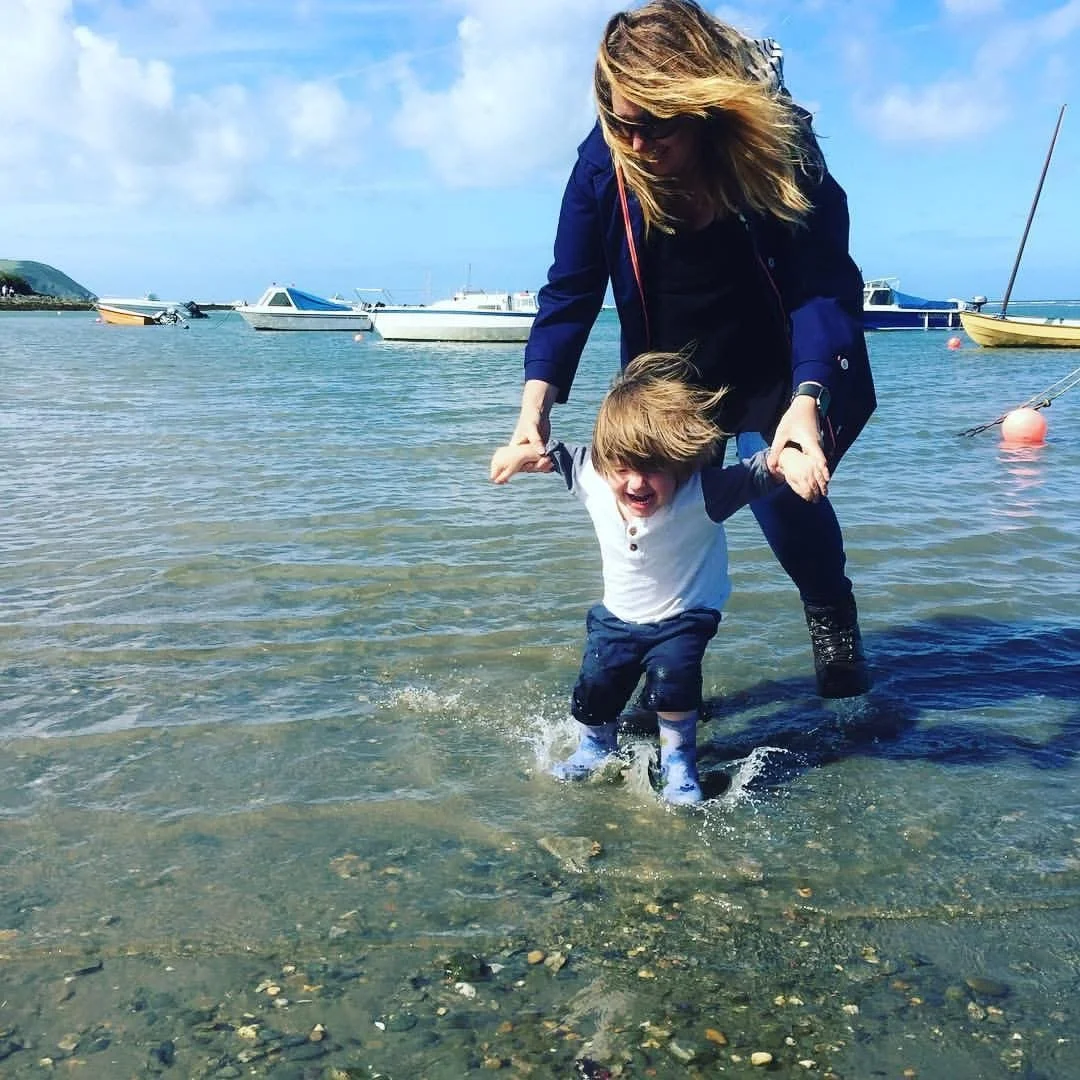
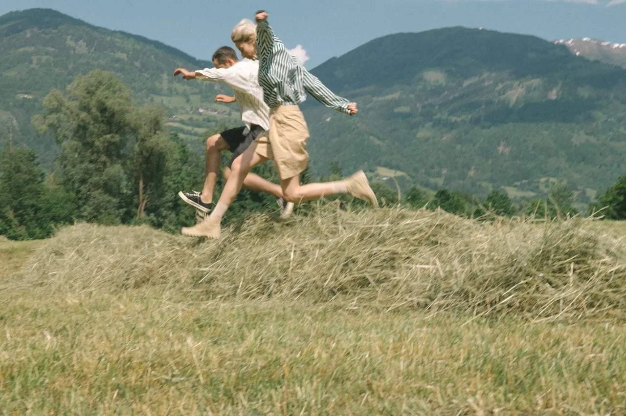
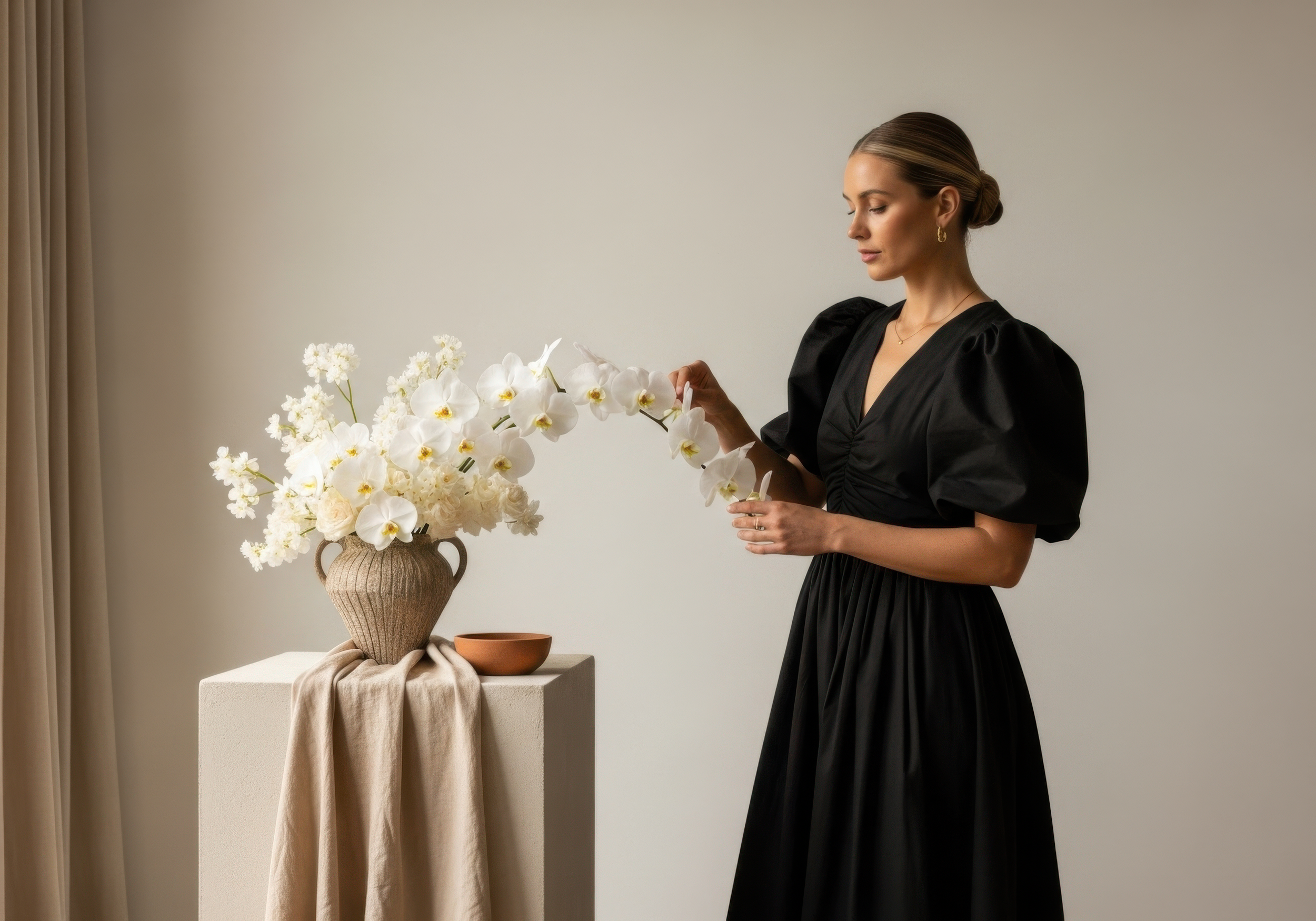
Images
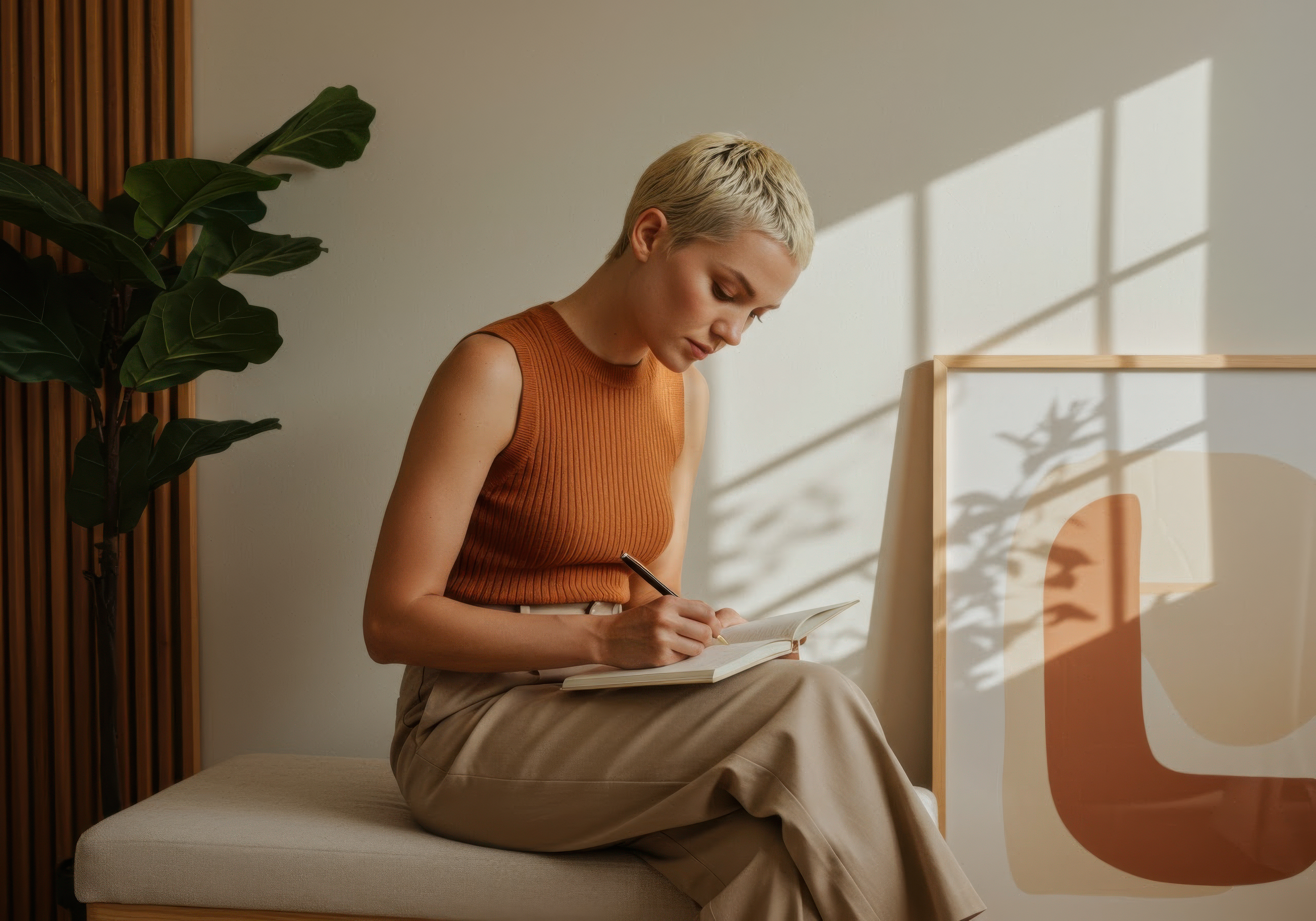
Add or change pictures by double clicking on the photo, and clicking the “Content” tab.
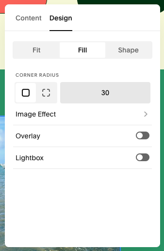
Images have a 30% corner radius (to make the edges rounded). If you’re adding a new image block, edit the corner radius in the “Design” tab (see image right).
Buttons
There are three button options, for variety. Often they are used as described right, but it’s personal preference which you want to use where.
Tertiary Button
Use for sub-sections.
Primary Button
Use for main sections.
Secondary Button
Use for standalone CTA’s.
Lightest 1 Theme
Creativity is the art of connecting the seemingly unconnected.
In design, we transform abstract concepts into tangible experiences that resonate with users. Through thoughtful iteration and bold experimentation, we craft solutions that are both functional and beautiful.
Lightest 2 Theme
Creativity is the art of connecting the seemingly unconnected.
In design, we transform abstract concepts into tangible experiences that resonate with users. Through thoughtful iteration and bold experimentation, we craft solutions that are both functional and beautiful.
Light 1 Theme
Creativity is the art of connecting the seemingly unconnected.
In design, we transform abstract concepts into tangible experiences that resonate with users. Through thoughtful iteration and bold experimentation, we craft solutions that are both functional and beautiful.
Light 2 Theme
Creativity is the art of connecting the seemingly unconnected.
In design, we transform abstract concepts into tangible experiences that resonate with users. Through thoughtful iteration and bold experimentation, we craft solutions that are both functional and beautiful.
Bright 1 Theme
Creativity is the art of connecting the seemingly unconnected.
In design, we transform abstract concepts into tangible experiences that resonate with users. Through thoughtful iteration and bold experimentation, we craft solutions that are both functional and beautiful.
Bright 2 Theme
Creativity is the art of connecting the seemingly unconnected.
In design, we transform abstract concepts into tangible experiences that resonate with users. Through thoughtful iteration and bold experimentation, we craft solutions that are both functional and beautiful.
Dark 1 Theme
Creativity is the art of connecting the seemingly unconnected.
In design, we transform abstract concepts into tangible experiences that resonate with users. Through thoughtful iteration and bold experimentation, we craft solutions that are both functional and beautiful.
Dark 2 Theme
Creativity is the art of connecting the seemingly unconnected.
In design, we transform abstract concepts into tangible experiences that resonate with users. Through thoughtful iteration and bold experimentation, we craft solutions that are both functional and beautiful.
Darkest 1 Theme
Creativity is the art of connecting the seemingly unconnected.
In design, we transform abstract concepts into tangible experiences that resonate with users. Through thoughtful iteration and bold experimentation, we craft solutions that are both functional and beautiful.
Darkest 2 Theme
Creativity is the art of connecting the seemingly unconnected.
In design, we transform abstract concepts into tangible experiences that resonate with users. Through thoughtful iteration and bold experimentation, we craft solutions that are both functional and beautiful.
read the blogInformation, guides and thoughts on life with AuDHD